Street Art
Mapping Portugal’s street art, one wall at a time.
An interactive atlas of ~600 geolocated artworks, built from a SIC newsroom report.

Context
Portuguese street art doesn’t sit still. A wall painted on Monday is gone by the weekend; a stencilled face that survives a winter becomes part of someone’s commute. By 2016, the scene had become impossible to follow without a map — and no map existed.
SIC’s newsroom commissioned a report on urban art in Portugal, produced by journalist Ana Marisa Silva. The reporting surfaced something the broadcast couldn’t fully contain: an enormous, scattered, undocumented body of work that cried out for a navigable digital surface. The microsite — designed and built around the reporting — was the answer.
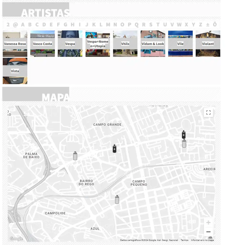
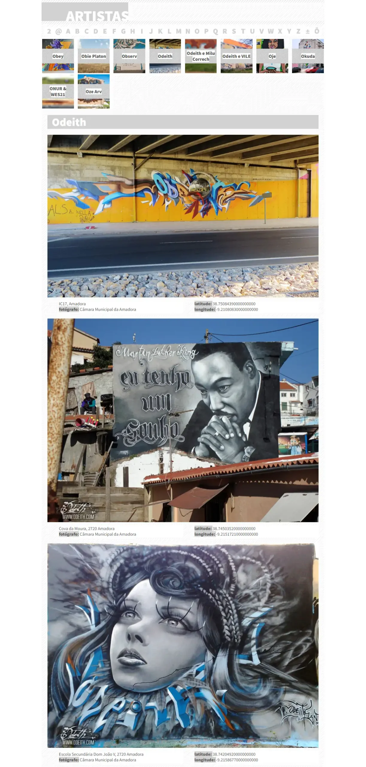
The result was a national interactive atlas: around 600 artworks geolocated, photographed, attributed, and browsable by region or by artist. Not an accompaniment to the broadcast piece. A standalone digital project that gave the reporting a second life, and a longer one.
open navigation
Approach
The brief sat at the intersection of three disciplines — data journalism, interactive cartography, and editorial design — and each one made demands the others didn’t.
Geography as the primary navigation. The map was the interface. Users could explore by zooming into a region, or filter by artist, or follow a single artist’s work across the country. No menu, no taxonomy chrome — the map did the editorial heavy lifting on its own.
Photography first, copy second. Each entry was anchored in a high-resolution photograph of the work, with concise metadata: artist, location, date, photographer credit. The interface stayed deliberately quiet so that the work could be loud. Street art photographs are already maximalist; putting them inside busy chrome would have created visual noise on top of visual noise.
A structure designed to grow. From day one, the atlas was built as a living archive — sufficiently flexible to add new pieces, new artists, new regions without requiring redesign. The premise was that the scene wouldn’t stop, so the map shouldn’t either.
Outcome
The atlas launched as the first national resource of its kind in Portugal. The Expresso write-up summarised it bluntly: “Não existe nada do género em Portugal.”
Beyond the launch coverage, the project found its second life as reference material — used by journalists covering the scene, by curators sourcing artists, by city walkers planning their afternoons. A modest piece of digital infrastructure that documented an inherently temporary art form, and helped a country see its own walls more clearly.
Credits: Microsite design and development — José Meireles. Based on the SIC newsroom report produced by Ana Marisa Silva.
Next Steps
1. Introduce Community Uploads & Moderated Submissions
Allow users, photographers, and artists to add new works directly to the platform. A light moderation layer would maintain the archive’s credibility while enabling it to grow organically with real-time contributions.
2. Expand Mapping with Routes, Themes, and Smart Suggestions
Enhance the location view with curated paths (“Hidden Gems”, “Political Murals”, “By the Riverside”), allowing users to plan their own cultural walks. Intelligent recommendations could suggest nearby artworks as users browse or move through the city.
3. Artist Profiles with Interviews, Process Videos, and Studio Features
Deepen storytelling by inviting artists to share their voice — transforming the site into a hybrid between an archive and a cultural magazine. This would strengthen connections between audiences and creators.
4. Partnerships with City Councils, Galleries, and Cultural Initiatives
Collaborations could expand the platform’s scope, offering official recognition, resources for preservation, and visibility for urban artists
A note years later
The version of me who designed these sites cared deeply about restraint. The version of me writing this case study still does, but I’d push the typography further now — borrow more from poster-making and gig flyers, the actual graphic vernacular of street art. The design at the time was respectful. It could have been more conversant.