Impresa Group Website
28+ brands, one corporate front door.
A redesign of the corporate website for Portugal’s largest media group.
over the fold area

The Challenge
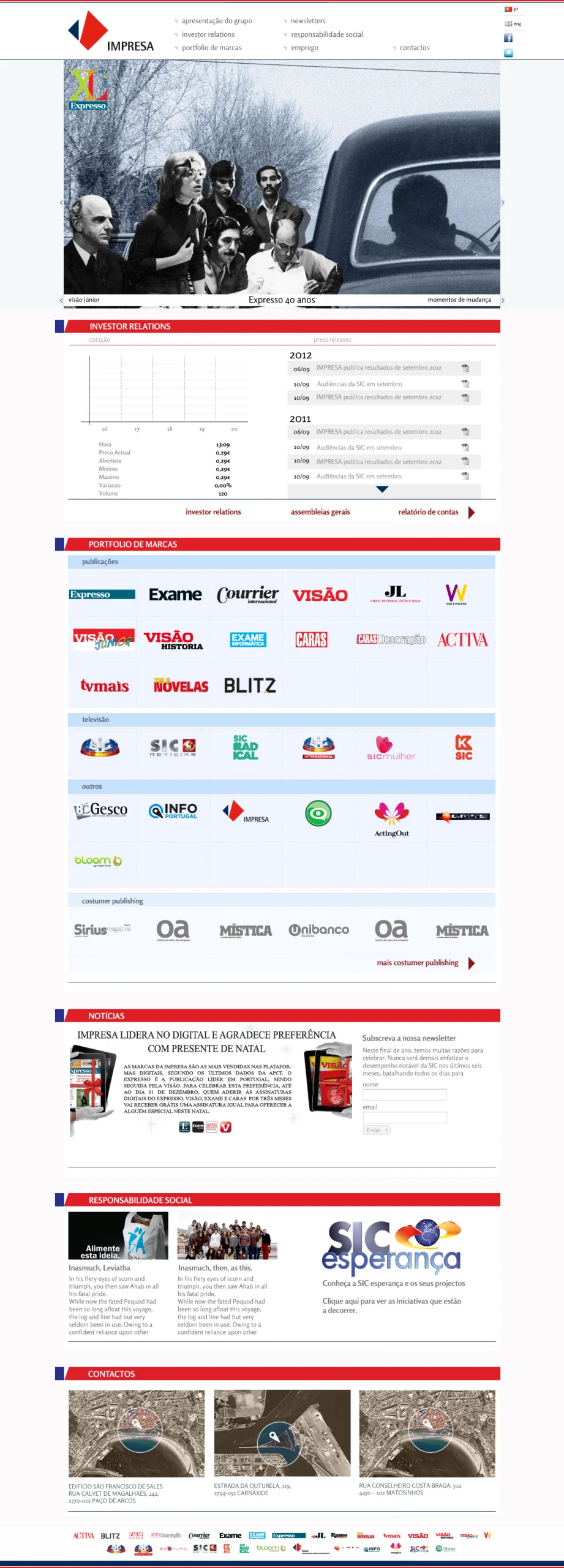
Impresa operates one of the most diverse media portfolios in the country. SIC’s TV channels. Expresso. Visão. Activa. Caras. Dozens of in-house brands across format and audience. By the time this redesign started, the corporate site had grown into something closer to a static org chart than a working communication platform — a place where commercial partners couldn’t find media kits, journalists couldn’t find press contacts, and the group’s own teams struggled to surface their projects to the outside world.
The brief, translated from polite into direct: stop costing the commercial team time, and start showing the strategic weight of the portfolio.
Three structural problems to solve:
- Navigation collapsing under 28+ brands — drop-downs unusable on mobile
- Featured projects buried two or three clicks deep
- Each brand page built bespoke over years, costing time to navigate
Approach
Flat top nav, four destinations. I took the drop-downs out and built a flat top nav with four destinations the user actually needs (Brands · Projects · Press · Contact). Submenus moved to the bottom of relevant pages, encouraging exploration without front-loading complexity.
A featured-projects carousel as the homepage hero. Instead of opening with a “Welcome to Impresa” banner, the homepage opens with a rotating carousel of campaigns and launches with high commercial relevance — the work the group actually wants people to discover.
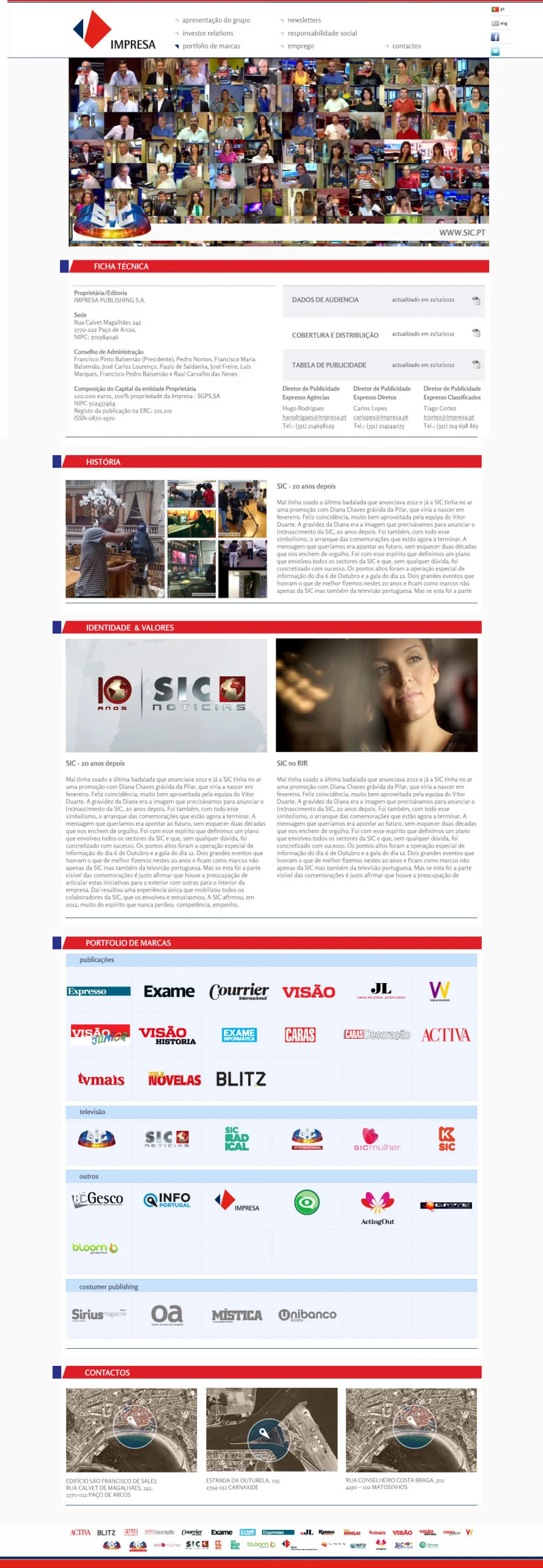
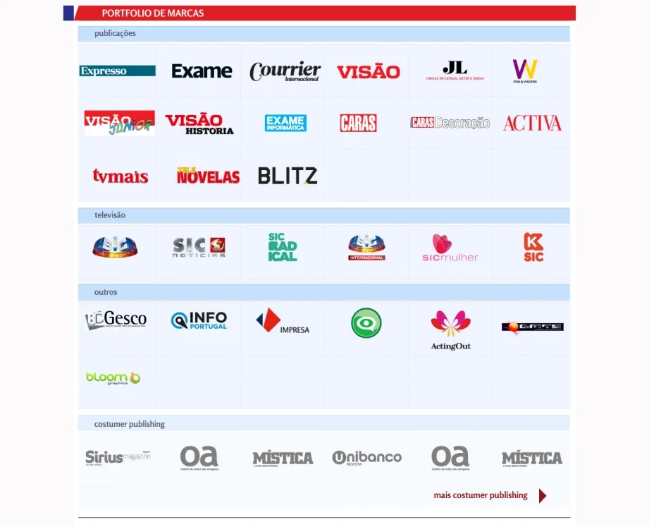
One template for all 28+ brand pages. Ownership data, latest projects, commercial contacts — same structure on every brand page. Partners moving between brands stop having to relearn the page.
Brand colour as the differentiator inside structural consistency. Rather than imposing a single corporate palette across all 28+ brand pages, I extracted accent colours from each brand’s existing logo to create distinct but coherent regional pockets within the same template. A brand director recognises their brand’s colour the moment they land on its page, without anything else having to change.
brand menu
Outcome
The redesigned site moved Impresa’s corporate presence from “static directory” to “working publication.” For internal teams, surfacing a new project became a CMS task rather than a custom build.
The hardest part wasn’t the design — it was resisting the temptation to give every brand its own personality on its own page. With 28+ brands, that path leads to chaos. Forcing consistency across the template, and letting brand colour do the differentiating, was the call I’d make again.