Blinkist Onboarding & Offboarding Redesign
This project was developed during the UI/UX Design Bootcamp at EDIT Disruptive Education by a five-member team: André Silva, Carolina Bettencourt, Francisco Chagas, José Meireles, and Sandra Gonçalves.
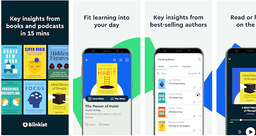
Together, we set out to enhance the onboarding and offboarding experience for Blinkist, a microlearning platform renowned for its concise 15-minute summaries of non-fiction books.
About Blinkist
The Challenge
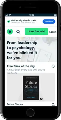
Blinkist offers concise text and audio book summaries tailored for busy professionals. Since its launch in 2012, it has been featured on the App Store more than 500 times, received the Android Excellence Award, and earned the United Nations World Summit Award in the Education & Learning category.
Despite its success, Blinkist has faced repeated criticism around subscription flows. Users report frustration at having to provide payment details before accessing a free trial, and many describe the cancellation process as confusing and manipulative.

“(…) one of the most unfriendly user interfaces I’ve experienced. Especially one I’ve paid for, meaning I will definitely NOT be renewing.”
Luke Browning

Leslie Alexander

This is one of those companies that try to make it impossible for you to cancel. They have pop ups that keep you going in circles. I am at the point that I am ready to cancel my credit card to get rid of these guys.
Gary Foss
Source: Google Play | trustpilot
Interviews & usability tests
Preliminary insights showing onboarding pain points
Our research confirmed these issues.
Studies show that 90% of users believe onboarding can be improved, and 80% delete apps they don’t quickly understand.
Survey results – 4 closed questions | 1 open question | 104 answers
In our own survey, 78% of participants stated that they would not share their payment details until they had tried the product. Their reasons included distrust, fear of forgetting to cancel, and a desire to experience value first.
Conclusion: Request payment data only after the free trial.
To humanise these insights, we developed a persona: Nicholas Forestier, a tech-savvy entrepreneur with limited free time. Nicholas values speed, clarity, and control; yet, Blinkist’s current journey forces him through lengthy personalisation steps, aggressive trial prompts, and complex cancellation paths.
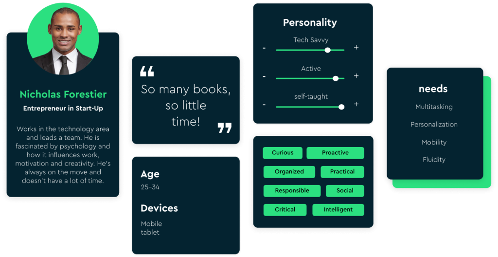
As an entrepreneur, I have very little free time.
I want to use this free time productively to optimise knowledge acquisition.
Acceptance criteria:
Knowledge can be consumed in the background (audio format).
Access to knowledge has to be fast and straightforward.
Before committing to the platform, I want to try it out.
Design Goals
Based on our findings, the team defined four objectives:
- Simplify first access to content
- Build trust by deferring payment
- Optimise user time by removing unnecessary steps,
- Ensure cancellation is transparent and respectful
Proposed Solutions
Onboarding
Existing task flow

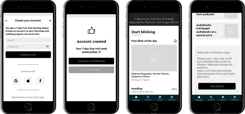
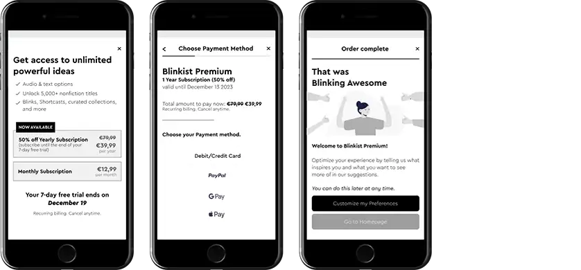
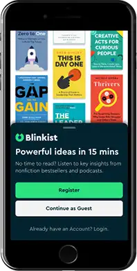
We introduced a “Continue as Guest” option so users could explore Blinkist before committing. Personalization became optional, and subscription offers (such as a 50% discount) appeared later, once users had experienced value.

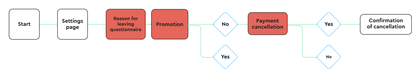
Offboarding
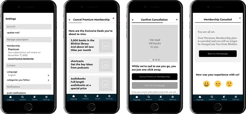
Existing task flow

Wireframes
Login as guest and account creation mid-fi wireframes
Premium subscription mid-fi wireframes
Offboarding mid-fi wireframes
PROTOTYPES
Click image to visit app prototype