salesmapp identity, website and app
We were asked to do something unfashionable for salesmapp: use data so that a salesperson will actually want to look at it when they are opening their email at 8 a.m. On a Tuesday. There are many competitors in the space with dashboards that won awards but lost customers. So, we decided to go the opposite route: each screen should be able to explain itself as soon as it is loaded.
The Challenge
One tone of Voice. one brand. But Three deliverables. The brand needed to appear confident on a billboard. The website needed to convert cold visitors into demo requests. And the app needed to seem calming while being held by a salesperson driving between meetings. If there is no thread connecting these Three items, then we will end up with Three separate projects.
More specifically:
- the identity needed to stay out of the b2b blue-grey gravitational field without turning into a children’s game.
- the website needed to educate the visitor about the product as he scrolls – i.e., “schedule a demo to learn more” friction needs to be eliminated.
- the app needed to present the correct lead at the correct time without overwhelming the user with notifications.
Approach
Identity first. Defended in plain sight. A wordmark with a chromatic gradient. Flat across all surfaces. Bold call: in b2b, most gradients read consumer or childlike. The defense is that salesmapp’s product is about movement – territories, routes, momentum – and static logo wouldn’t carry that. The rest of the identity (typographic treatment, layout grids, secondary color) was built quietly on purpose to let the wordmark be the only energy-carrier.
Teaching website. Each section opens with an unasked question the visitor has already been asking him/herself. What does this number mean? How is this different from a CRM? What happens after i sign up for your service? The page reads as an FAQ rendered as landing pages. Trick: the user’s curiosity performs conversion work; we just stop blocking it.
Mobile app that respects driving time. The home screen of the app is a map. Pin, see lead. Lead, see action. Three taps from launch to dialled call. Settings, history and admin are demoted to profile tab users open once per week.
Logo Design
The Salesmapp wordmark was born from a place that many B2B sales technology projects might view as unorthodox – by applying a colour gradient to the typography itself.
Salesmapp’s products are centred around motion (the crossing of territories, planning of routes, conversion of leads). Therefore, a static one-colour logotype would convey none of that. If you add a separate icon to a static wordmark, you will be adding another item for people to memorise. We chose to allow the type to demonstrate the dynamic nature we were trying to illustrate, and we made an intentional choice to go against what is considered fashionable.
The gradient flows across the letter forms in a controlled manner using a specific spectrum and this spectrum has been calibrated to four B2B color traps that the project specifically did not want to create or use: corporate blue (which indicates “we charge by user”), sterile teal of all SaaS dashboards, safe black on white (which can cause confusion between a logo and a watermark), and the toy box rainbow (which communicates “consumer” vs. “enterprise”).
Every other design decision related to identity was implemented in a quiet and deliberate way. A neutral typographic system. Space for breathing. A secondary colour palette that steps back. The logo is the loud element; nothing else is permitted to take away from it.
We tested the system in environments where logos typically fail quietly:
- 16-pixel favicon — readable
- monochromatic print application — the gradient could be removed, but the letterform holds its own
- dark surface knockout — the gradient reverses cleanly
- presentation slide thumbnail at 5% page width — legible
Logotype
App Design
The Salesmapp app was designed around a single observation: salespeople don’t open productivity apps from a desk.
They open them from the driver’s seat, between meetings, with one hand, on a phone propped against the steering wheel at a red light. They open them in elevator lobbies, in coffee queues, in the thirty seconds before walking into a client. The app’s design had to respect that reality first and aesthetics second.
That principle drove the structural decision: the home screen is a map, not a dashboard. Tap a pin, see the lead. Tap the lead, see the action. Three taps from launch to dialled call. Settings, history, and admin — anything that doesn’t survive the “elevator-lobby test” — got demoted to a profile tab the user opens once a week, not once an hour.
A few specific decisions:
Map-first, not map-as-feature. Most CRM apps treat geography as a tab. Salesmapp inverts that: the map is the navigation layer, and the lead list is the secondary view (swipe-up to access). This sounds small. In practice, it changes how the app gets used — salespeople plan routes naturally, instead of jumping between a list view and a map view that don’t talk to each other.
Bottom-anchored controls. Every primary action sits within thumb reach of the bottom of the screen. The top of the screen carries information, not interaction. On a phone held one-handed, this is the difference between a usable app and an app that gets uninstalled after a week.
Notifications as suggestions, never demands. A salesperson driving between meetings cannot be interrupted by a buzz that pulls their eye from the road. The app’s notification pattern is calm by design — daily morning summaries, end-of-day recaps, opt-in alerts for high-priority leads only. No badges by default. No “you have 47 unread items” anxiety. Information when the user wants it.
Calm typography. The data inside the app is dense. The typography is deliberately not. Generous line-height, restrained type scale, plenty of whitespace between rows. Density was achieved through hierarchy, not through visual compression.
The internal benchmark, throughout: could a salesperson explain what’s on this screen in one sentence to a colleague? Anything that failed got rebuilt.
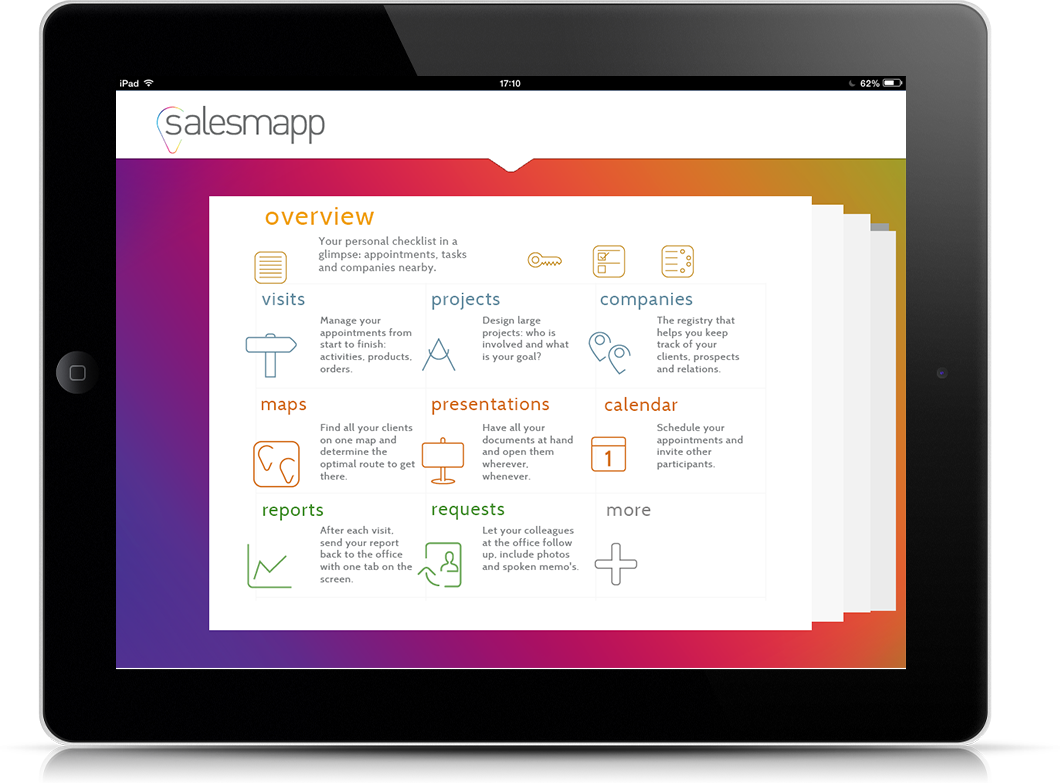
App intro page
Website Design
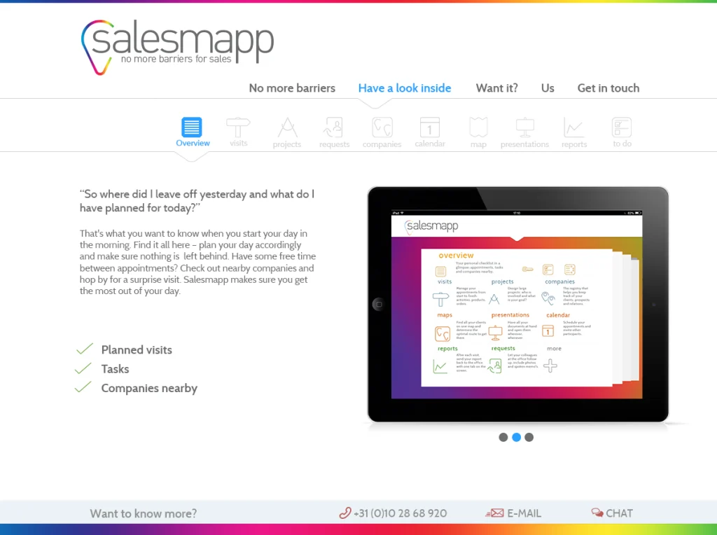
The Salesmapp marketing site was built to answer the visitor’s questions in the order they actually arrive.
Most B2B SaaS websites follow a fixed liturgy: hero with vague promise, three icons in a row, a customer logo strip, a CTA to schedule a demo. The visitor leaves knowing that the company exists and that other companies use it, but not what the product actually does. The conversion friction is then attributed to “the funnel needing optimisation,” when the real problem is that the page never taught the visitor anything.
The Salesmapp site was structured against that pattern.
Every section opens with a question the visitor was already half-asking. “What does this number mean?” “How is this different from a CRM?” “What happens after I sign up?” The page reads like an FAQ rendered as a landing page. The trick is that the visitor’s curiosity does the conversion work; the design just stops blocking it.
Product screenshots, not abstract illustrations. Most SaaS marketing sites visualise their product as friendly geometric shapes — vague enough to dodge UX critique. Salesmapp’s site shows the actual interface: real maps, real lead cards, real numbers. The visitor sees what they’d be using before they sign up. Risk: it commits the design to look like the product. Reward: it tells the truth.
A teaching scroll, not a sales pitch scroll. The page is structured so that a visitor who reads from top to bottom understands the product end-to-end. By the time the demo CTA appears below the fold, the visitor has the context to evaluate the offer. CTAs earlier in the page are softer — “see a sample lead view”, “watch a 90-second walkthrough” — calibrated to the visitor’s stage of curiosity.
Conversion signals defended against pollution. No exit-intent pop-ups. No live-chat bot that opens unprompted. No countdown timers manufacturing urgency that doesn’t exist. The page trusts that a visitor who’s read this far is making a real decision, and stops trying to manipulate the moment.
Page weight as a design constraint. B2B prospects often evaluate sites from corporate networks with strict bandwidth profiles. Image weight, font loading, third-party scripts — all audited against a hard budget. The site loads fast on a five-year-old laptop on hotel WiFi. That’s not a technical achievement to be proud of; it’s the baseline that should have been there from the start.
The page does what the rest of the brand does: it explains itself the moment it loads.
HOME page
Collaboration & Process
Salesmapp was built through a deeply collaborative process. Designers, developers, and data analysts worked closely together, communicating frequently and adapting as needed.
We followed an iterative, sprint-based workflow — testing, learning, refining. Prototypes evolved not only in their appearance but also in their functionality. Each round brought new insights, which were folded back into the design.
Our guiding principle never changed: clarity through design. Regardless of the user’s technical expertise or the complexity of the data, our goal was to make the system navigable, practical, and easy to understand.
Outcome
The shorthand internal metric was simpler. We tested every screen against a single question — “can a salesperson explain this in one sentence to a colleague?” If the answer was no, we rebuilt it. By launch, every screen passed.
other pages
Reflection
The hardest design decision was resisting the urge to add a second hero illustration to the homepage. The first one was working; a second would have felt safer. It’s the move I would’ve made five years ago. Trusting that one strong image plus tight copy can hold a page — that’s a thing you only learn after watching a hundred pages get diluted by “let’s add one more thing.”