Cinco
Five Romance languages, one shared digital home.
An EU-supported educational platform built around the principle of intercomprehension.
The Challenge
CINCO was a European-funded educational initiative built around a beautiful and unusual idea: intercomprehension. The premise that speakers of one Romance language can understand related languages through structural recognition — without formal translation, without years of study. Five Romance languages, treated as cousins rather than as separate territories.
The website was the project’s central digital infrastructure: simultaneously a resource library for teachers, a community space for students, and a public communication channel for the funding body and the European partners.
Designing for EU-funded multilingual educational projects produces constraints that don’t exist in commercial work:
- Three audience types with three different needs (teachers, students, project coordinators)
- Five languages, deliberately no hierarchy — no language could act as primary or default, or the project’s premise would be undermined
- A long content lifespan — EU projects often outlive their original team; the site had to remain maintainable for years after launch
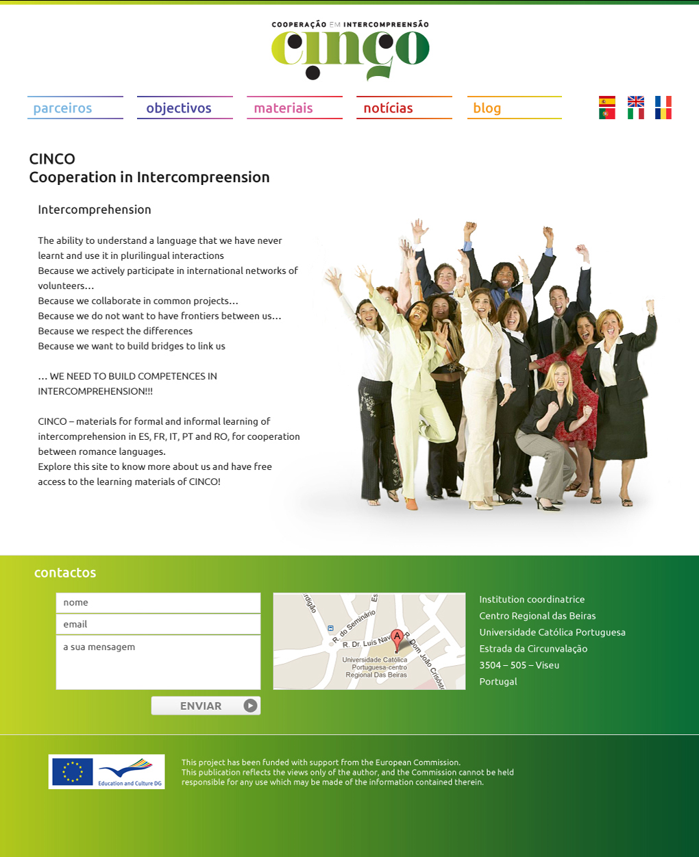
home page
Approach
An information architecture mapped to user journeys, not org structure. Instead of organising the site around the project’s internal categories (work packages, deliverables, partner outputs), I built around three user journeys: Discover (news, project background), Learn (resources, lessons, exercises), and Share (community, partners, events).
Subtle linguistic colour-coding. Each of the five languages was assigned a discreet accent tone, calibrated to be recognisable without becoming flag-driven or stereotyping. The colour appeared in language-section headers, breadcrumbs, and link states.
Restrained typographic hierarchy for text-heavy content. A serif for body, a sans for navigation, generous line-height, narrow measure. Reading-first; decoration nowhere.
A modular content block system. News, resources, partner profiles, events — all variations of three base templates. New content could be added by educators without designer involvement. Critical for the project’s longevity.
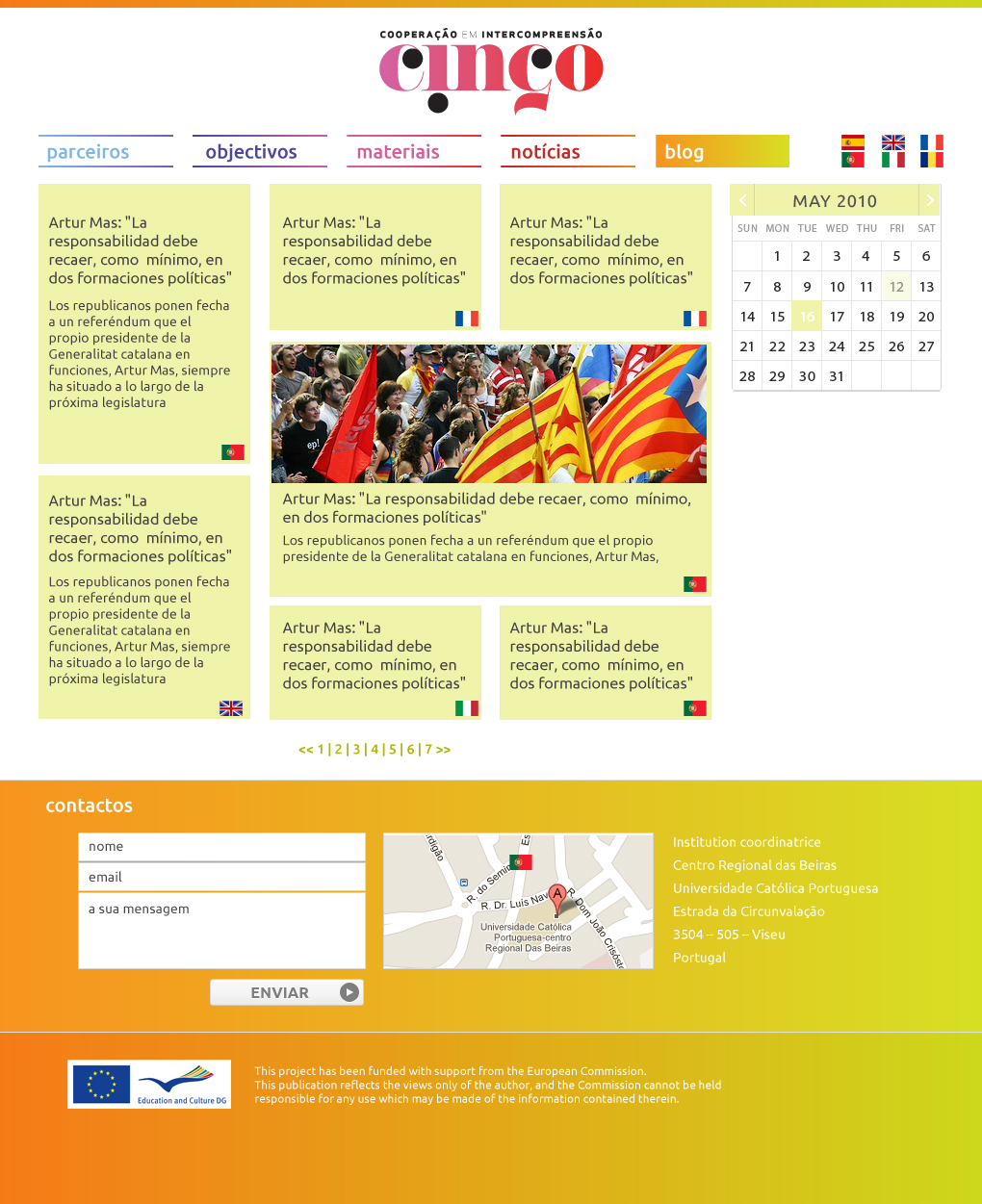
blog page
Outcome
CINCO launched with the support of the European Commission as the central digital touchpoint for a multi-country educational initiative. It functioned as resource library, community space, and public communication channel — three functions in one architecture, used by educators and students across five countries.
The hardest design decision was keeping the site quiet. There’s a strong temptation in cultural-exchange projects to celebrate the diversity loudly — different colours, different fonts, different visual languages per country. Every prototype that went that direction fragmented the experience. The published design did the opposite: it gave the five languages the same elegant container and let the content do the differentiating.