SIC – 20 Anos
Two decades of Portuguese television, one homepage.
An anniversary commemorative interface for SIC’s 20th year on air.
The Challenge
SIC went on air in October 1992, breaking Portugal’s public broadcasting monopoly. For viewers who lived through it, the launch wasn’t a TV event — it was a cultural permission. A second voice. A faster pace. A different idea of what Portuguese television could sound like.
Twenty years later, in 2012, SIC asked the web team to design a homepage for the anniversary — something that didn’t just announce the celebration but embodied two decades of programming, presenters, faces, moments. A digital flagship for a year of looking back.
The history is dense. Hundreds of presenters. Thousands of programmes. Decades of news, fiction, sports, music, entertainment. Compressing that into a single homepage without producing a visual landfill was the central problem:
- Honour SIC’s most iconic programmes and people without ranking them
- Hold an enormous quantity of imagery without becoming a database dump
- Maintain coherence across radically different programme identities (news vs soap operas vs sports)
- Give users a sense of discovery rather than a static “Happy Birthday SIC” banner
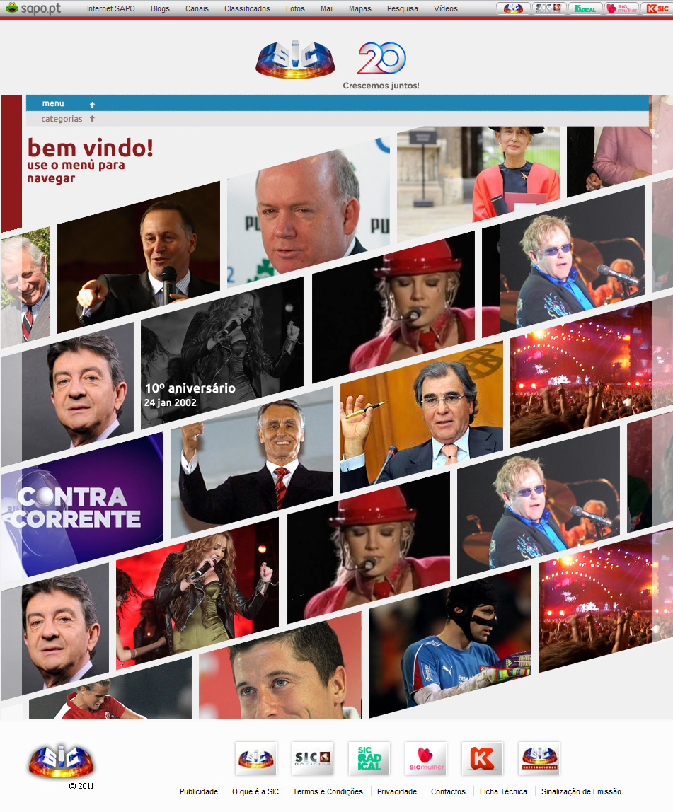
home page
Approach
Collage, not grid. A standard rectangular module layout would have read corporate and quiet — wrong for a 20-year tribute. Wrong, specifically, for SIC, whose on-air language had always been faster, looser, more graphic than its competitors’. The homepage was built as a collage: diagonal cuts, overlapping tiles, asymmetric clusters. The visual language echoed editorial moodboards and TV montage sequences rather than CMS templates.
Tiles as story fragments. Each tile carried a story unit — a presenter, a programme, a moment, an archive clip. Together, the tiles formed an emotional, non-chronological timeline of the channel’s evolution. The order wasn’t strict; the discovery was the point.
On-air graphic language, ported to web. SIC’s broadcast graphic language at the time used layered transitions, bold typographic accents, and brand-colour overlays. I carried those patterns into the page so the homepage felt like an extension of the on-air anniversary identity rather than a separate web product.
Restraint in the chrome. With the content this loud, navigation, headers, and footers had to step back. Minimal nav, generous whitespace at the page edges, a single anchored brand mark.
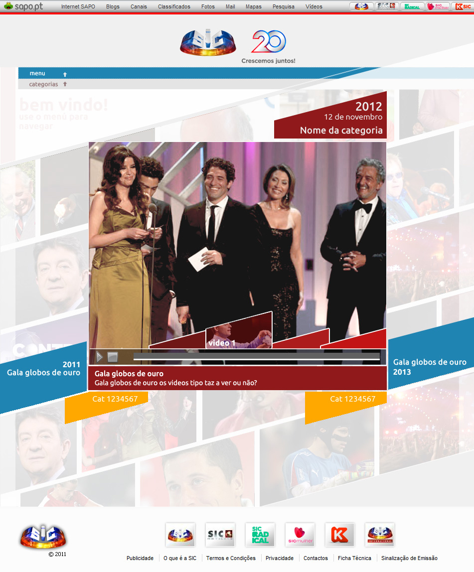
video page
Outcome
For the duration of the anniversary year, the homepage served as the visual anchor for the celebration online — a page users scrolled rather than navigated, lingering instead of clicking through.
The decision I’d defend hardest is the choice of collage over grid. Grid would have been safer and easier to maintain, but it would have produced a quieter, cooler page — wrong for a 20th anniversary. The collage forced harder editorial decisions about what to feature and what to leave out, and that pressure made the final selection sharper.