Newsletters & landing pages
Crafting an effective email is both a strategy and a form of storytelling — a balance where design guides the eye and structure shapes the message. My approach focuses on clarity, rhythm, and visual harmony, turning simple updates into meaningful brand moments. The same principles apply to landing pages, where clean layouts, a persuasive flow, and intentional details help convert attention into action. Whether in the inbox or on the web, these pieces are designed to be clear, engaging, and impossible to ignore.
Bigham's
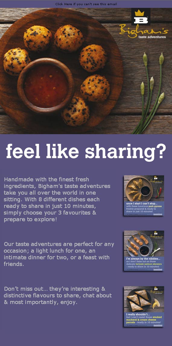
This seasonal email adopts a more dramatic, luxurious aesthetic, featuring deep blacks and rich golds to evoke a sense of festive indulgence. The photography becomes the star, with elegant overhead compositions that feel both premium and handcrafted. A clear typographic hierarchy guides the reader effortlessly through the messaging, from bold opening lines to detailed product descriptions and a curated ingredient list. Despite the abundance of information, the layout remains light and elegant, mirroring the sophistication of the canapés themselves. The overall experience is celebratory, expressive, and designed to spark both appetite and anticipation during the holiday season.

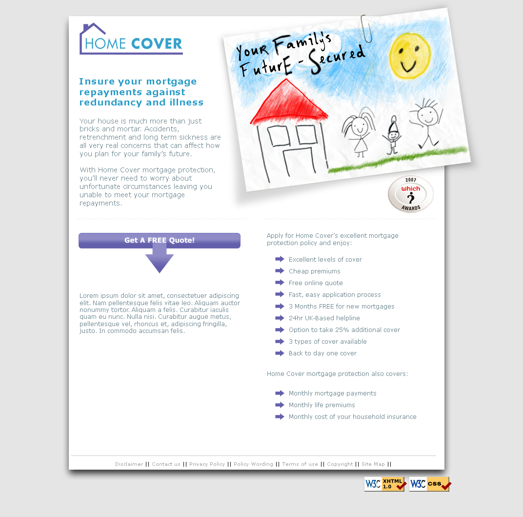
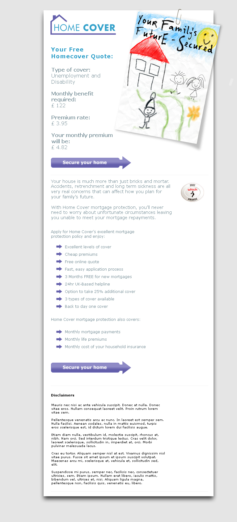
Home Cover Insurance
This email is designed to provide clarity and reassurance on a topic that can often feel complex or overwhelming. The layout combines soft tones, generous spacing, and friendly visual cues to create an atmosphere of stability and trust. The childlike illustration introduces a human touch — a reminder that home protection is ultimately about people, families, and the peace of mind they deserve. Clear typographic hierarchy guides the reader through their personalised quote, benefits, and next steps with effortless readability. The strong call-to-action anchors the design, striking a balance between approachability and confidence. Overall, the piece transforms essential financial information into a calm, supportive experience that helps users feel informed, protected, and ready to take action.
This landing page was designed to bring warmth and reassurance to a service that can easily feel cold and transactional. By pairing a clean, structured layout with a charming, childlike illustration, the design bridges emotional comfort with practical clarity — reminding users that mortgage protection is ultimately about safeguarding the people they love. The soft grey background and subtle shadows create a gentle sense of depth, while the blue and purple accents guide the eye toward key information and the primary call-to-action. Carefully balanced typography ensures readability across benefits, features, and supporting content, making the page feel approachable and trustworthy. Built around a clear conversion path, this landing page turns insurance messaging into a friendly, confident, human-centred experience.