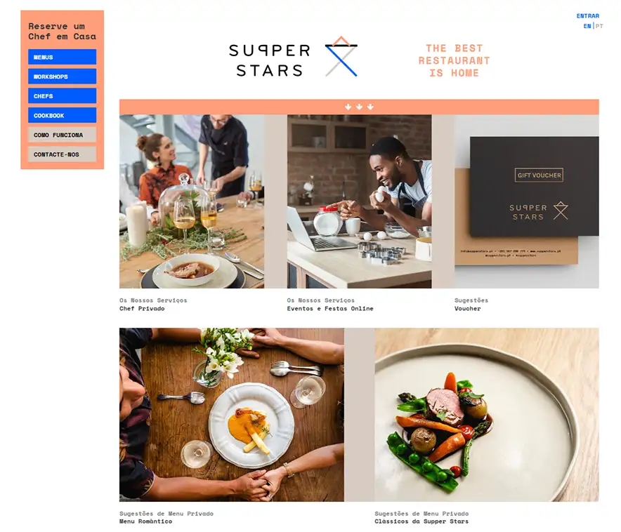
SupperStars – Bringing Chefs Home
This project was developed during the UI/UX Design Bootcamp at EDIT Disruptive Education by a five-member team: Bernardo Silva, Carolina Bettencourt, Débora Neiva, José Meireles, and Sofia Guerra.
Together, we set out to reimagine Supper — a service that connects users with professional and amateur chefs who cook meals in the comfort of their homes.
About SUPPERSTARS
Imagine the night your closest friends turn up for dinner. The wine is already open. The conversation already started. Nobody is hiding in the kitchen.
The chef arrives, quietly, with a box of ingredients and a plan.
That’s the product Supper Stars sells. Not food, exactly. Not a restaurant. A small piece of theatre that lives inside your own home, performed by a professional chef who’ll be gone by midnight.
The Portuguese brand has built a network of professional chefs who travel to clients’ homes for private dinners — birthdays, anniversaries, intimate celebrations. The chef arrives, cooks, plates, serves. The guests stay at the table. The host stays in the conversation.
It’s a beautiful product. It also happens to ask users to do something most apps never ask: invite a stranger into their home.
The Challenge
A restaurant gets one chance to earn you. A chef in your kitchen gets several.
Will they be on time? Will they be tidy? Will they like your knives, your pans, your tiny gas hob? Will your six-year-old hate the asparagus and start a small political incident? Will the chef be a good sport about it, or will the night curdle?
These are not questions a user types into a search box.
They are questions that sit, unspoken, in the body.
And they are the questions a chef-booking app has to answer before the credit card comes out.
The brief we received was a routine UX audit of the booking flow. Find the friction. Smooth it out. Improve conversion.
Two weeks in, we knew the brief was wrong. The booking flow wasn’t broken. The trust architecture around it was.
Research & Insights
We sampled three sources to triangulate.
User interviews with 83 participants — half who’d booked Supper Stars before, half who’d considered and bailed.
Review mining across publicly available channels — what users praised, what they complained about, what they kept silent about.
Competitive teardowns of adjacent booking experiences — restaurant reservations, home-service apps, peer-to-peer marketplaces.
Two patterns surfaced. Repeatedly.
Pattern one. Users who’d considered the service and bailed all stopped at the same step: choosing a chef. Too many profiles. Too similar.
Photos of unfamiliar faces. Bios that read like CVs. Decision paralysis disguised as abundance of choice.
Pattern two. Users who’d booked successfully described something more interesting. Their trust in the chef peaked after the booking, not before — when the chef would message them personally to discuss the menu, allergies, the size of the table, whether the daughter could eat seafood. A real human, on the other side, treating the dinner as theirs.
That message was the trust moment. And it was buried after the riskiest part of the funnel — the payment.
The design question wrote itself: how do we move that moment forward?
Design Goals
We set four goals. Tight. Specific. Anti-generic.
One. Reduce decision paralysis at the discovery step. Differentiation between chefs has to be legible at a glance, before the user reads anything.
Two. Surface trust signals during browsing, not after booking. Reviews, voice notes, photos of past meals — pulled earlier in the funnel.
Three. Reframe the chef confirmation message as a relationship beginning, not a transaction completing. That moment is the trust peak. Treat it as such.
Four. Keep the visual language warm without becoming twee. This is hospitality, not children’s media. The line is finer than it looks.
These goals belong to this product. They aren’t portable. A redesign of an insurance app would never set goal three.
App map
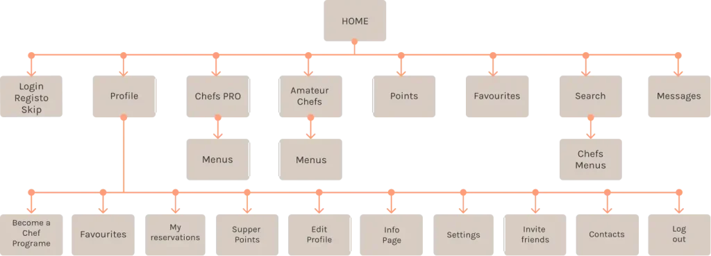
Task flow for register

Task flow for reservation
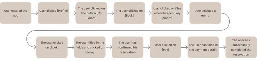
Task flow for user Supper Points
Proposed Solution
The booking flow itself stayed structurally similar. Three steps, same order: choose a chef, choose a menu, confirm.
The interesting work happened earlier — in the chef-discovery layer, where users were dropping out.
Each chef card was rebuilt to carry, in three legible lines:
- A cuisine signature, written in the chef’s own voice
- The dish past guests had loved most (chosen by guests, not by the chef)
- A short voice note — actual audio — from a previous customer
Three pieces of information. Layered. Doing the emotional lifting that fifteen photos and a five-paragraph bio had been failing to do.
The chef confirmation step — previously a transactional success screen — was redesigned as the moment of welcome. A short note from the chef, the menu draft, an open thread to discuss anything before the night.
The visual language stayed warm. Soft tones. Generous whitespace. Photography of food in domestic settings, not styled studio plates. Hospitality typography — a serif for headlines, a clean sans for navigation. Nothing decorative. Nothing childish.
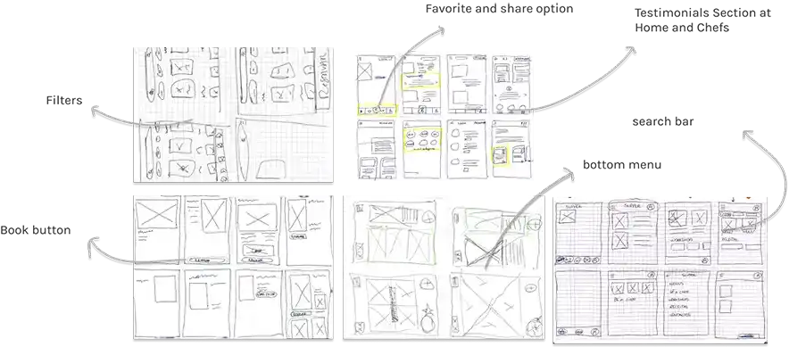
Low-fidelity wireframes
Mid-fidelity wireframes
Registration, Homepage, Profile and Points

Search, Menu, Booking

Payment

Twelve participants tested these prototypes.
Their feedback confirmed the improvements: users found navigation intuitive, appreciated having more visual cues, and instantly understood how the points system worked once it was reframed as discounts rather than abstract rewards.
Adaptations after 1st Testing
We took the first prototype to 8 users and watched them try to book a chef.
Three things broke immediately.
The voice notes were too long. We’d let testimonials run 15-20 seconds. Users tapped to play, listened for three seconds, and tapped away. Trust requires brevity at this stage. We capped the voice notes at 8 seconds and forced ourselves to choose the strongest sentence in each.
The “most-loved dish” line was misread. Users assumed it was a dish the chef recommended, not a dish past guests had chosen. Same words, different reading. We rewrote the label from “Most loved” to “Past guests’ favourite” — clunkier, but unambiguous.
The chef confirmation moment landed flat. We’d treated it as a screen redesign; users experienced it as just another transactional step. The fix was structural: we shifted the entire confirmation into a chat interface, mimicking the messaging app the user already opens fifty times a day. Familiar metaphor doing the trust work.
Bottom Navigation Bar

More emphasis on PRO Chefs

Menu page

The Book button is now always visible and sticky at the bottom of any Booking page

Several users were confused by the system
Points = Something extra on booking
We adapted for
Points = Discounts

2nd Usability Test
A second round, with new participants, on the revised prototype.
Three observations from this round.
The shorter voice notes worked. Completion rates on the discovery step rose. Users described the chef profiles as “easier to compare” and “less overwhelming.” Two users specifically mentioned the audio as the moment they’d decided.
The chat-style confirmation was the most praised element of the redesign. Users said it made them feel “remembered” rather than “processed.” The framing — a relationship beginning rather than a transaction completing — landed without our having to explain it.
A new friction appeared. Some users hesitated at the menu-selection step, unsure how customisable the menu actually was. Could they request changes? Was the menu fixed? The interface didn’t say. We hadn’t tested for this in round one because the friction sat outside the booking flow’s main path.
Adaptations after 2nd Testing
For the menu-selection friction, we added a small persistent affordance below every menu: “Want to adjust this? Message the chef.” One line. One link. Routed into the same chat interface that now anchored the confirmation step.
It wasn’t a structural change. It was a permission. Users needed to be told that customisation was on the table — that the menu was a starting point, not a contract.
The other two areas of the redesign — voice notes, chat confirmation — held up. We didn’t touch them.


Testing showed significant improvements in comprehension, satisfaction, and task completion.
Users described the process as intuitive, transparent, and enjoyable.
The points system was easily understood and valued, while chef profiles created genuine trust and connection. Navigation improvements — including the sticky button and consistent interface — helped users stay oriented throughout the journey.
The Supper app evolved from a confusing website into a polished, user-centred experience that highlights what the brand stands for: food, connection, and shared moments at home.
By focusing on real user needs and emotional engagement, we transformed Supper into a service that feels as personal and rewarding as the meals it helps create.
Next steps

Two pieces of work we’d take forward if this were a continuing engagement.
A/B test the voice note format. Audio felt right in testing. But “felt right” is not a metric. The honest test would put audio against written quotes against video clips and let conversion data settle the argument. My gut still says audio. My designer-self knows the gut isn’t enough.
Design the chef onboarding side. This redesign focused on the guest. But the trust experience is mutual — chefs are also evaluating whether to take a booking, in whose home, on what terms. A future round would address the chef’s experience of the same product, with the same care.